Frontend Forever App

We have a mobile app for you to download and use. And you can unlock many features in the app.

Get it now
Intall Later

Responsive Bootstrap Website

About this Code

       Hello reader, I am frontendforever. Nice to meet you again in this free code sharing website. In this post I am going to explain about Responsive Bootstrap Website. If you are new to this website, we recommend you to subscribe to our youtube channel and watch the videos. Ok lets dive into the code.

WHAT IS BOOTSTRAP?

The most widely used CSS framework for creating responsive and mobile-first websites is Bootstrap. 
Bootstrap Files are Too Big! As was already noted, because of the sheer amount of functionality provided by its framework, Bootstrap files can be somewhat huge. Website load times may lengthen as a result, especially on slower networks.
Beginners could struggle to locate and correct this problem, but as was already noted, the customized tool on the Bootstrap website can assist you to remove any extra code for features you'll never use.

History of Bootstrap

On Twitter, Mark Otto and Jacob Thornton created the Bootstrap framework. On GitHub, it was made available as an open-source product in August 2011.
The most popular project on GitHub in June 2014 was Bootstrap.

Is Bootstrap Best?

One of the top and most popular HTML/CSS/JS front-end frameworks is Bootstrap. Almost all web designers who have created a few websites have heard of this well-known framework. Because it provides so many pre-made resources and components, Bootstrap may considerably speed up the construction of your application.

The key factor influencing Bootstrap's popularity in the online design sector is its distinct and alluring characteristics, which enable programmers to easily create completely responsive websites with excellent functionality.

What is meant by responsive web design?

An technique to creating web pages called responsive design uses flexible layouts, flexible graphics, and media queries in cascading style sheets. The objective of responsive design is to create web pages that recognise the size and orientation of the visitor's screen and adjust the layout accordingly


STEPS TO CREATE :
  1. Name the new file bootstrap.html after creating it.
  2. Set the background as cover after inserting the background image.
  3. The image should have some linear gradients.
  4. Include a link to the bootstrap website in your text.
  5. The bootstrap would now be correctly inserted.
  6. Include the navigation bar and give it a box-shadow.
  7. Write the content in the beginning and center it.
  8. Watch the step-by-step tutorial I'm giving.
  9. Here is a Tamil tutorial link: https://youtu.be/V2j8xXoKpW0
  10. Here is a link to an English tutorial: https://youtu.be/nA5oAGH-FhI
  11. I hope this tutorial was enjoyable.

Images

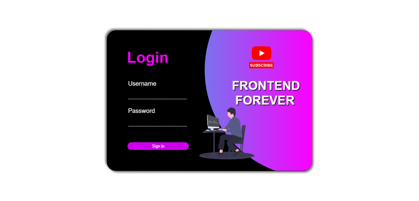
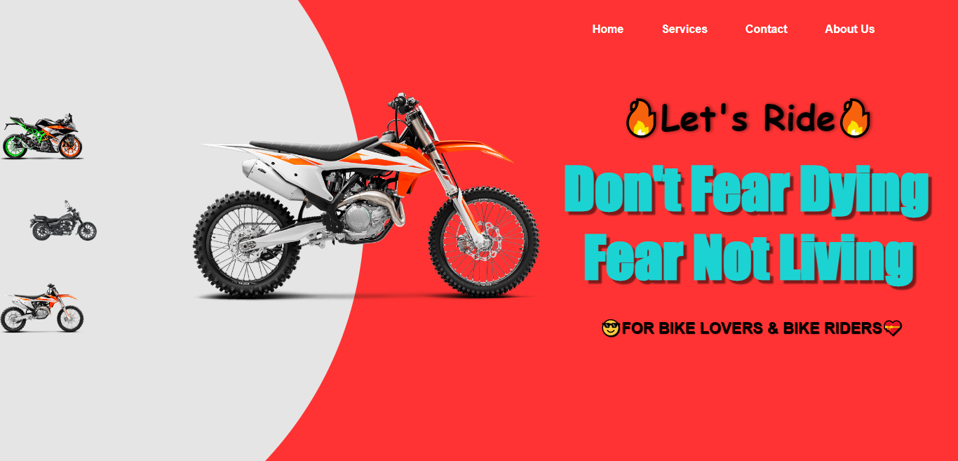
These are the output images of the code. You can click on the image to enlarge it. also you can click the try it button to see the output.

Youtube Tutorial Video

If you are a visual learner and want to learn how to use this code, you can watch the video below.
and also this video contains the clear step by step explanation and the output of the code.

Source Code

This is the source code of the code. You can copy and paste the code to your editor.

And also you can click the try it button to see the output of the code in our web Code Playground.
You can also download the code to the zip format by clicking the download button. The download process is little bit complex, you need ti await for 10 seconds. after that you can download the code by clicking the generated download link.

Leave a Comment

You need to login first to comment.